Monday, 22 March 2010
Manish Arora
Manish Arora is an Indian fashion designer based in New Delhi. He is a well known designer of India origin. His collections have been shown in London Fashion Week for four season since his debut in 2005, and went on to show at Paris Fashion Week for the Autumn–Winter 2007–08 and continues to show there each season. He is known for a rich palette of psychedelic colours and kitsch motifs, in garments that combine traditional Indian crafts like embroidery, appliqué and beading with Western silhouettes, it is this combination that i find most appealing and I think that this is what I would like my final piece to be a combination of.
Thursday, 18 March 2010
Abu jani & Sandeep Khosla
I discovered Abu Jani & Sandeep Khosla when trying to find Indian designers, and these are about the biggest around. They both grew up in India so inevitably their clothes are the essence of it. They design beautiful intricate pieces ranging from dresses to sari's. There clothes are exquisite pices that specialise in embroidery and embelishment. I love their work and feel that i links so well with my oproject due to the coours, shapes and detail.
Alexander McQueen Final Collection
I have been looking at clothes designers that relate to my project and its theme so I can gain inspiration and techniques that i can translate onto my final piece. I have been looking at Alexander McQueen's final collection and love the bright, rich colours he uses and the intricate yet bold embellishment. I think i could combine these with my own ideas in order to produce my final piece.
Josh Cleary
I recently visited Brick Lane in East London so as to gain an understanding of the culture of India and as i was walking I stumbled across the Brick Lane Art Gallery. By chance i found the artist Josh Cleary's work there which links in extremely well with my work. I took this from Cleary's own page as i felt it summed his work up well "I deliberately choose to draw inspiration from popular culture to ensure viewers either directly recognise an image or have seen one similar to it. This avoids making people stand in front of an artwork wondering what it is about. I feel that if there is no hidden meaning, there is no reason to question its purpose. This allows viewers to simply enjoy the colours, the image and the medium. Basically, I paint and make images that I like, and that others can make. I believe that just about anybody could quickly learn the stencilling techniques required to make work in a similar fashion to this."
The work exhibited used vibrant colours and had the essence of India, he used shapes with lots of movement and most angles were circular again continuing the idea of cycles. Here are y favourite pieces......
Chris Ofili
I recently visited the Chris Ofili exhibition at the Tate Britain, I absolutely loved it. His work was a crazy juxtaposition of colour, vibrancy and serious political issues which in turn created an almost humorous vibe. I thought his work tied in well with mine as he uses great embellishment similar t that used on Indian clothing, there was glitter everywhere! He worked on a large scale but still managed to create intricate detail. I would like to use Ofili's colour scheme and the way he manges to create such busy and exciting works.
Beware of Embroidery!
"Beware of Embroidery is a new exhibition that features the work of five international contemporary artists who use embroidery as a medium to communicate their ideas and visions. Each artist will present a series of work, variously political, historical or social, created using both traditional and innovative methods and materials.
The exhibition aims to overturn preconceived ideas about the meaning and impact of embroidery and celebrates the energy and diversity that exists within the medium. The artists will confound expectations as they investigate and experiment with the practice of modern embroidery.
Expect this medium to be pushed to it’s boundaries!" This was taken from the Ealing council website and I felt that it summed the exhibition up extremely well. It was a visually exciting exhibition that allowed embroidery to take center stage! There were an array of artists who showed skill, precision and flare however I loved the work by Tilleke Schwarz from the Netherlands. She makes quirky pieces of a combination of hundreds of stitches and different techniques to create challenging and interesting works. Tilleke say herself that her work is " a mixture of graphic quality, content and fooling around. The humor in my work is typical for my Jewish background: a mixture of a laugh and a tear."
I loved her work and felt that by looking closely at her I could be influenced bu her vibrancy and intricate detail and embellishment which i will later use in my project.
I decided to draw a section of this piece and choose to draw the lizard as i loved the techniques used to fill it, i later used this technique with stitch and it crated a wonderful effect.......
The exhibition aims to overturn preconceived ideas about the meaning and impact of embroidery and celebrates the energy and diversity that exists within the medium. The artists will confound expectations as they investigate and experiment with the practice of modern embroidery.
Expect this medium to be pushed to it’s boundaries!" This was taken from the Ealing council website and I felt that it summed the exhibition up extremely well. It was a visually exciting exhibition that allowed embroidery to take center stage! There were an array of artists who showed skill, precision and flare however I loved the work by Tilleke Schwarz from the Netherlands. She makes quirky pieces of a combination of hundreds of stitches and different techniques to create challenging and interesting works. Tilleke say herself that her work is " a mixture of graphic quality, content and fooling around. The humor in my work is typical for my Jewish background: a mixture of a laugh and a tear."
I loved her work and felt that by looking closely at her I could be influenced bu her vibrancy and intricate detail and embellishment which i will later use in my project.
My photo response
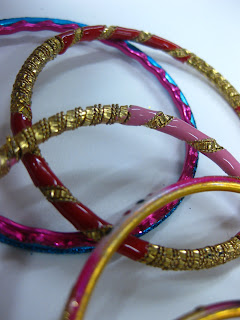
Now that I have gained my initial idea i needed to take some photos in response I took a first set of photos that I felt encompassed the essence of India through their bright colours and the fact that they are circular ties in well with the idea of cycles.
I liked these photos as the vibrancy and embellishment I felt really portrayed the jubilance of Indian culture. However I thought that in some ways they were very limiting as when i went to draw one i felt that the layout and composition was not strong enough. Also although I love the use of colour i wanted to use a different colour scheme, one that resembled more the metal, gold and silver statues that I saw in the British Museum, so I decided to take another set of photos so as though I had more variation and could therefor develop my ideas further. Here are my second set of photos.....
Subscribe to:
Posts (Atom)